

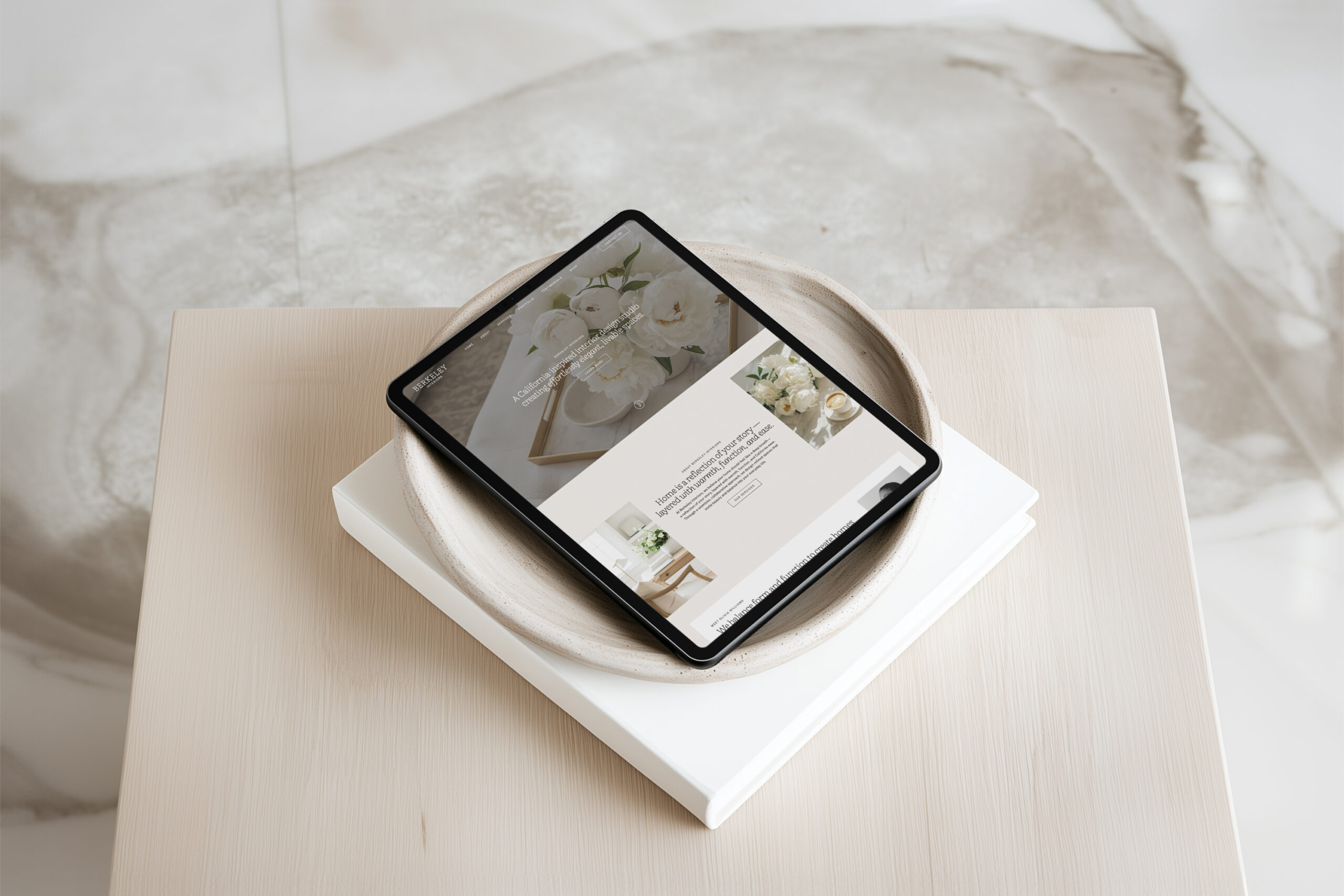
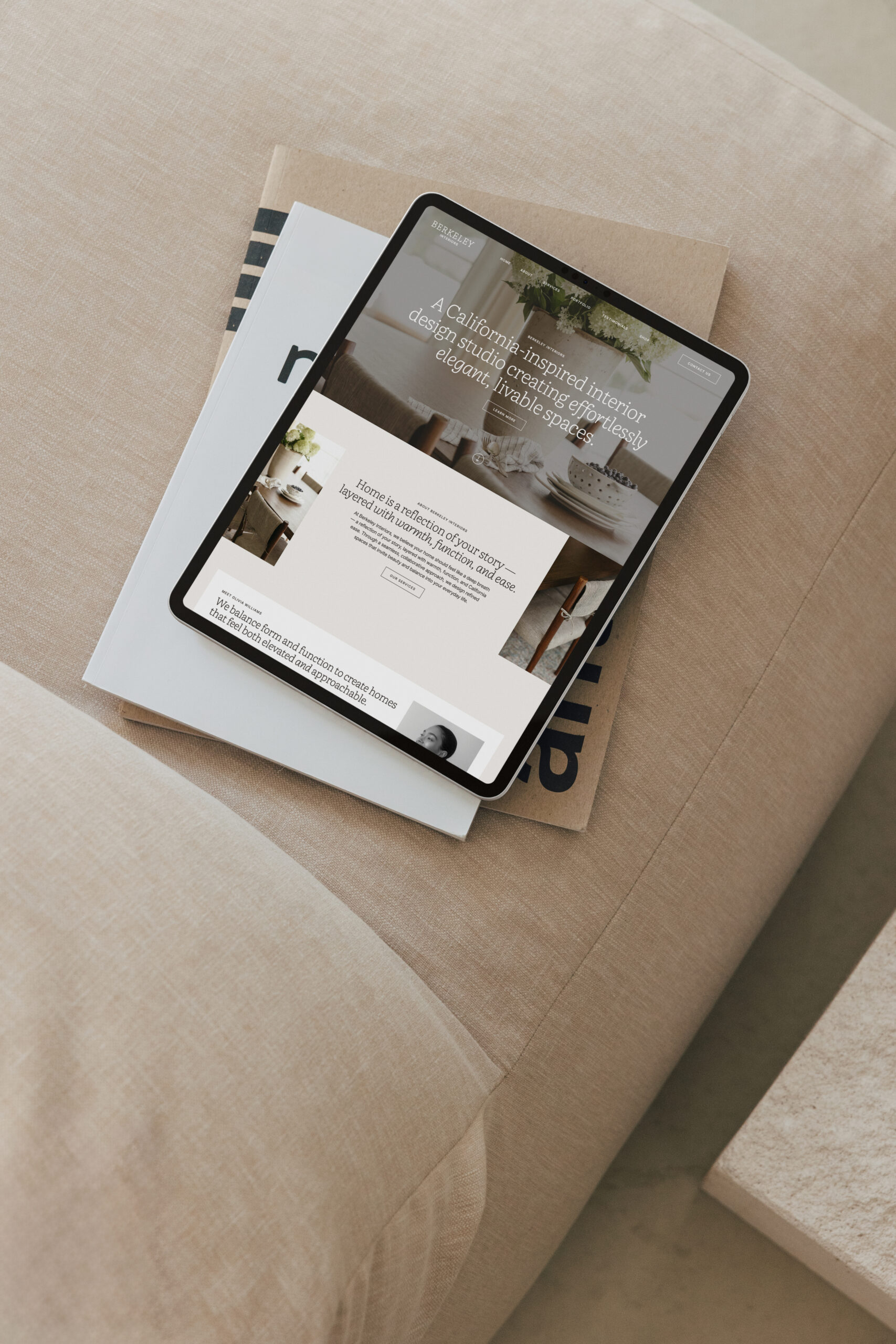
4 Quick Ways to Make Your Showit Website Mobile-Friendly
Having a mobile-friendly website is crucial for keeping visitors engaged and ensuring they have a seamless experience. Showit makes it easy to customize your mobile site, but it’s important to take a few extra steps to ensure your design is optimized for smaller screens. Here are four quick ways to make your Showit website mobile-friendly!
Make Your Showit Website Mobile-Friendly
Use Mobile-Specific Layouts
Showit allows you to fully customize the mobile version of your website. Take advantage of this feature by adjusting your layout specifically for mobile users. Avoid stacking too many elements on top of each other, as it can overwhelm visitors. Instead, prioritize a clean, simple layout with plenty of white space. Keep buttons large enough to be easily clickable on smaller screens, and ensure your text is legible on mobile devices.
Compress Images for Faster Load Times
Large, uncompressed images can slow down your mobile site, leading to a poor user experience. Compress your images before uploading them to Showit using tools like TinyPNG or ShortPixel to reduce their file size without sacrificing quality. Fast-loading images are essential for mobile users who might be browsing on slower networks, and they help keep your visitors engaged.
Prioritize Readability
Make sure your text is easy to read on smaller screens by using larger fonts and clear, legible typography. Avoid using small or overly decorative fonts that could be difficult to read on mobile devices. Stick to font sizes that are at least 16px for body text and 20px or larger for headings. Test your website on different mobile devices to ensure your content is easy to read across all screen sizes.
Test and Tweak
After making your mobile edits, test your site on multiple devices to see how it looks and performs. Showit offers a mobile preview mode, but it’s important to check how your site feels on an actual phone or tablet. Look for any elements that don’t display correctly, such as overlapping text or images. Regularly updating and tweaking your mobile design ensures that your visitors always have the best experience, no matter what device they’re using.
Final Thoughts
A mobile-friendly website is essential for providing a great user experience and keeping your visitors engaged. By using mobile-specific layouts, compressing images, prioritizing readability, and testing your site regularly, you can ensure your Showit website looks and functions beautifully on all devices. Ready to make your website mobile-friendly? Start with these quick tips and create a seamless experience for your audience!
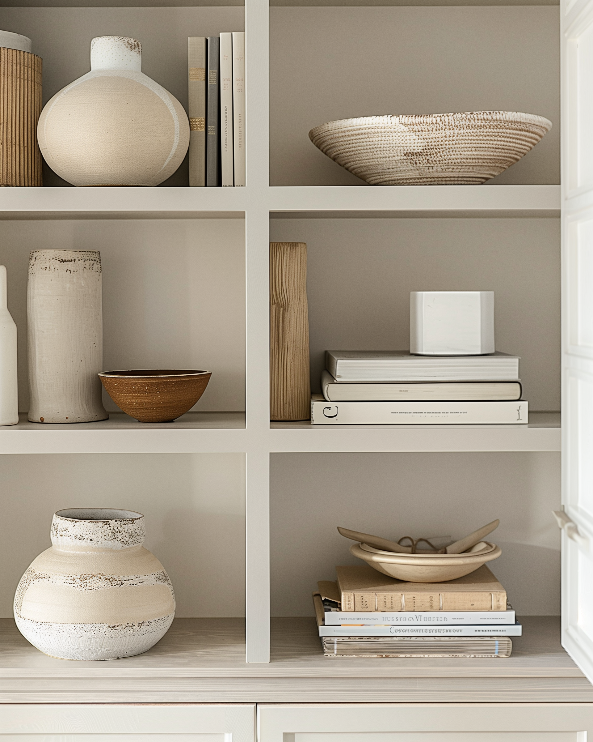
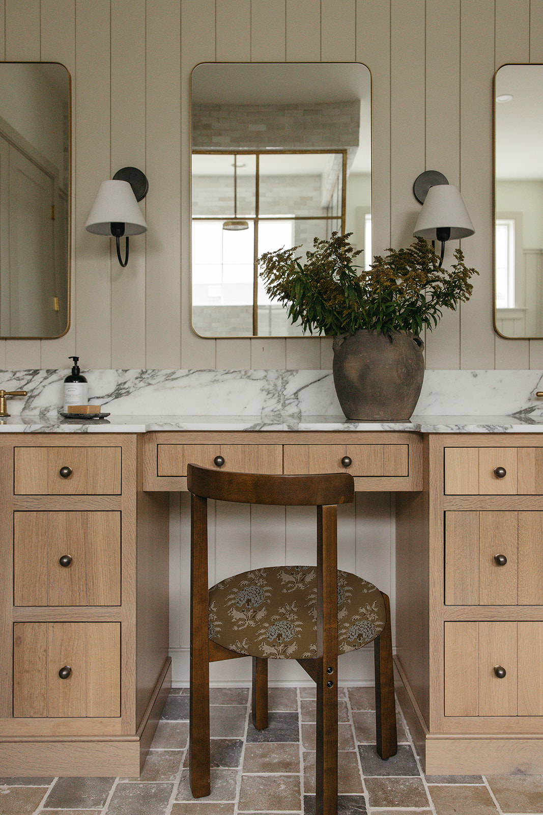
Marketing Templates for Interior Designers
Your interior design business deserves a brand and marketing strategy as polished and intentional as the spaces you create. At Coastal Template Co, we offer done-for-you Showit website templates, Flodesk newsletter templates, and Canva Instagram templates — designed to help you showcase your work beautifully, connect with your ideal clients, and market your interior design business with ease. Explore our collection of relaxed yet refined marketing templates for interior designers and create a seamless, sophisticated online presence that elevates your brand.

At Coastal Template Co, we believe your business deserves to shine online — without the overwhelm.
Backed by over 10 years of design expertise and a deep understanding of the interior design industry, we craft easy-to-customize templates that combine style and strategy.
Chosen by more than 3,000 interior designers, our templates help you showcase your work beautifully and market your business with confidence.
About Coastal Template Co.


Rooted in simplicity and style, each template is designed to reflect the elevated, polished look your business deserves.
Timeless, elevated design.

No code, no overwhelm. Just easy-to-use templates with drag-and-drop features to help you customize and launch confidently.
Simple, stress-free customization.

Every template is thoughtfully created just for interior designers — with layouts, features, and visuals that feel like home.
Designed for interior designers.


